There’s one decision that separates a Halloween page that looks like a shop display from one that looks like it was found in an attic, and it isn’t the pumpkins, the bats, or how neatly you cut.
It’s the colors. Get your Halloween junk journal colors right and almost anything you glue down will look intentional. Get them wrong and the loveliest cut-out in the world still reads as plastic. So let’s fix that first, with six palettes you can copy straight away.
The whole secret in one line: shop Halloween is bright orange and pure black. Vintage Halloween is amber, sepia, bone and brown-black. Swap those two things and every page you make changes character.
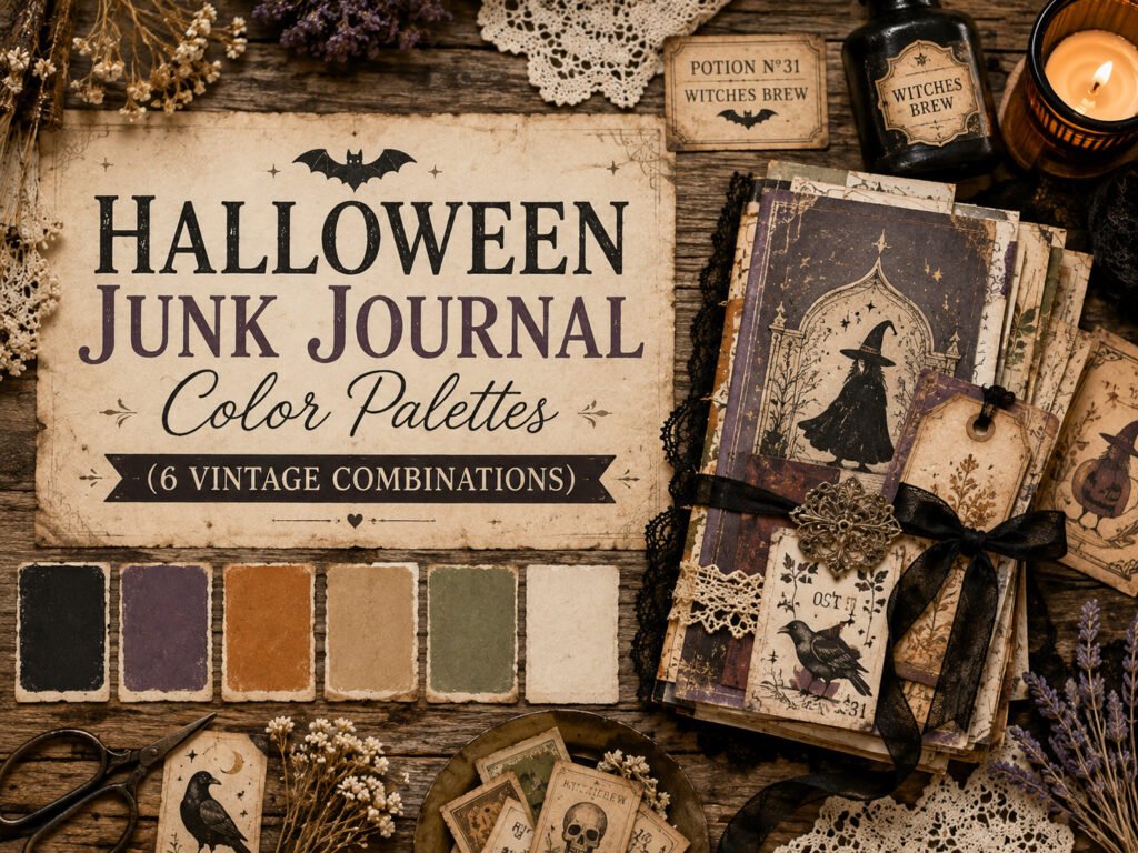
Why bright orange fights your pages?
Junk journaling is built on aged materials, yellowed book pages, brown Kraft, tea-stained paper, faded ink. All of those are warm and muted. They’ve lost their brightness, which is exactly why they look old.
Drop a saturated orange onto that and it sits on top of the page instead of settling into it. Same with pure black: it has no warmth in it at all, so it reads as a hole rather than a shadow.
Muted colors blend. Bright colors interrupt. That’s the entire principle, and once you see it you can’t unseen it.
1. Antique Apothecary:
Amber · Sepia · Brown-black · Bone
#C97B3C #8B5E3C #2B211C #E8DCC3
The classic vintage Halloween palette, and the safest place to start. It’s built on the colours of old glass bottles, aged labels and stained paper.
Use it for: apothecary shelves, potion labels, specimen pages, anything with handwriting.
Where to get it free: brown kraft paper for the sepia, tea-stained printer paper for the bone, old book pages for everything in between. Brown ink pad does the rest.
2. Haunted Parlour:
Faded rose · Dusty mauve · Olive-black · Cream
#B08A8A #7C6B7A #2E2E26 #F0E7D8
This is the palette of peeling Victorian wallpaper and a house nobody has lived in for a long time. It’s the most atmospheric of the six, and the least obvious.
Use it for: torn wallpaper layers, old photographs, lace, faded letters.
Where to get it free: the inside of greeting cards, old wrapping paper, envelope security linings. Grey-mauve is surprisingly common in packaging once you start looking.
3. Moonlit Garden:
Deep green · Ink navy · Silver-grey · Bone
#2F4034 #1E2A38 #B9BFC0 #E5E0D2
Cool rather than warm, which makes it stand out in a section full of browns. Reads as night-time and slightly witchy without any obvious Halloween motifs at all.
Use it for: moon phases, pressed herbs and leaves, botanical pages, moth studies.
Where to get it free: pressed leaves, newspaper for the grey, and any dark green packaging. A navy ink wash over cream paper gives you the deep tone.
4. Burnt Harvest:
Burnt orange · Rust · Deep brown · Oat
#B5581F #8C3B22 #4A2E1E #D9C9A8
Classic Halloween, softened. If you want pumpkins and autumn warmth without the plastic look, this is the one, it’s traditional orange dragged several steps towards rust.
Use it for: pumpkins, autumn leaves, harvest pages, anything that bridges Halloween and Thanksgiving.
Where to get it free: brown paper bags, real pressed autumn leaves, and coffee-stained paper, which comes out redder than tea.
5. Spooky-Cute:
Cream · Soft grey · Dusty pink · Charcoal
#F2EBDF #C9C3BA #D9A9A0 #4A4742
Gentle, pretty and completely un-scary. This is the palette for pages you’re making with children, or for anyone who likes the season but not the creepiness.
Use it for: little ghosts, black cats, friendly pumpkins, trick-or-treat memory pages.
Where to get it free: plain printer paper, tissue paper from deliveries, and pencil shading for the greys. This is the cheapest palette of the six.
6. Witch’s Cupboard:
Bottle green · Oxblood · Brass · Ink
#35503F #6E2A2A #A8813F #221D1A
The richest and most dramatic. Deep, saturated and old-world, it looks expensive on the page and works beautifully with gold or brass details.
Use it for: grimoire pages, herb cupboards, tarot tucks, anything you want to feel weighty.
Where to get it free: gold foil from chocolate wrappers, dark green and deep red packaging, wine labels.
Quick comparison:
| Palette | Mood | Difficulty | Best For |
| Antique Apothecary | Old, warm, bookish | Easiest | Labels & handwriting |
| Haunted Parlour | Faded, eerie | Medium | Torn layers & photos |
| Moonlit Garden | Cool, botanical | Medium | Herbs & moon pages |
| Burnt Harvest | Cozy, traditional | Easiest | Pumpkins & autumn |
| Spooky-Cute | Soft, friendly | Easiest | Children & gentle pages |
| Witch’s Cupboard | Rich, dramatic | Hardest | Grimoire & deep pages |
How to build a palette from what you already own:
You don’t need to buy paper in these colors. Three household techniques will shift almost anything you have into a vintage Halloween range.
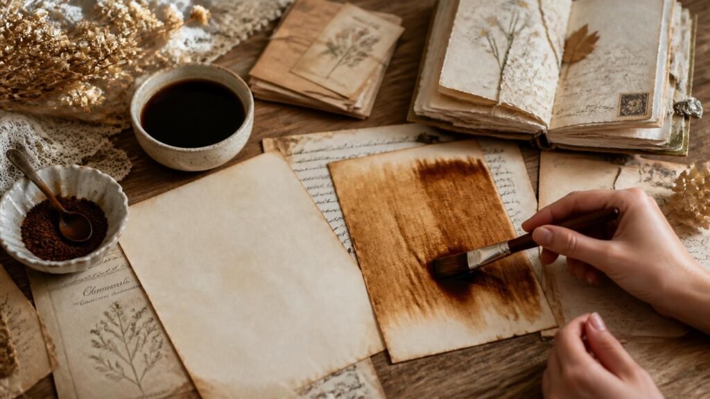
Tea gives you warm bone and sepia. Strong black tea, brushed on and dried, turns white paper into aged cream. Leave the tea bag sitting on the paper for a minute and you get darker blotches, which look even better.
Coffee gives you redder browns. Instant coffee dissolved in a little water gives you rust and burnt tones — closer to Burnt Harvest than tea will get you.
Brown ink kills brightness instantly. Any colour that’s too loud can be dragged across a brown ink pad or wiped with an inky finger. This is the single fastest fix on the whole page, and it takes about four seconds per piece.
The rescue trick: if a finished page looks too bright, don’t remake it. Brush a very weak tea wash over the whole thing and let it dry. Everything mutes together and suddenly belongs.
How many colors should one page have?
Three, plus a neutral. That’s the whole rule.
Every palette above has four entries, and the last one is always the neutral, bone, cream or oat. That neutral should cover most of the page, with your three colours appearing in decreasing amounts: one dominant, one supporting, one tiny accent.
Pages fall apart when all four fight for equal space. Let the neutral win and the others will look far more deliberate.
If you’d like ready-made pieces already sitting in these tones, bottles, moths, ghosts, pumpkins, our Halloween sets print at home and cut down in minutes. Have a look in our Etsy shop.
Test a palette in two minutes before you commit:
Before building a whole spread, do this. It takes two minutes and saves the hour you’d otherwise spend on a page that never quite works.
Tear four small scraps, one in each color of your chosen palette, and lay them on the page together, unglued. Look at them, then walk away and come back.
Three things to check:
- Is one clearly the neutral? If all four have similar weight, the page will feel busy no matter what you put on it.
- Does anything jump forward? The piece your eye lands on first should be the one you want to be the accent. If a background scrap is shouting loudest, mute it before you glue anything.
- Would they look at home in an old book? If one scrap looks like it came from a modern packet of card, it will look exactly like that on the finished page too.
Keep the scraps beside you while you work. Every time you’re about to add something, hold it against them first.
Three combinations that don’t work:
Worth knowing, because these are the ones that quietly ruin otherwise lovely pages.
Bright orange with pure black. The shop-Halloween pairing. Both are fully saturated with no age in either, so they sit on top of your aged paper rather than in it. If you want the classic look, use burnt orange with brown-black instead.
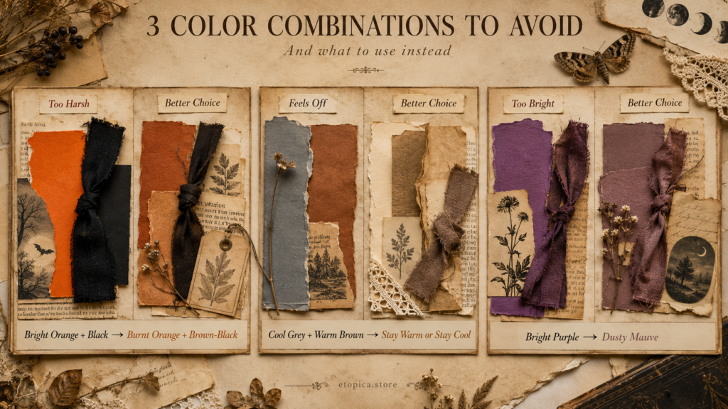
Cool greys with warm browns. Grey has a blue undertone and kraft has a red one, so together they look muddy rather than harmonious. Pick a lane: either the warm palettes (Apothecary, Harvest, Cupboard) or the cool ones (Moonlit, Spooky-Cute).
Purple with almost anything here. Halloween purple is nearly always a modern, plastic-leaning shade, and it fights aged paper badly. If you love purple, drag it towards dusty mauve, that’s the Haunted Parlor palette, and it works beautifully.
Frequently asked questions:
1- What are the best colors for a Halloween junk journal?
Muted, warm and aged: amber, sepia, rust, bone and brown-black. Avoid bright orange and pure black, which sit awkwardly on vintage paper because they have no age in them.
2- Can I still use orange?
Yes, just push it towards rust or burnt amber rather than traffic-cone orange. A quick brown ink wash over an orange cut-out will get you there in seconds.
3- Why does pure black look wrong on my pages?
Because it has no warmth, so it reads as a hole rather than a shadow beside aged paper. Use a very dark brown instead, or soften black paper with a light tea wash before gluing.
4- How do I choose a palette for a page?
Start from the mood, not the colors. Decide whether the page is antique, eerie, botanical, cozy, gentle or dramatic, the palette follows automatically from that.
5- Do all my Halloween pages need the same palette?
No, and it’s better if they don’t. Keep each spread to one palette, but let different spreads use different ones. The section stays cohesive because they’re all muted, even when the colors differ.
6- How do I make paper the right color without buying any?
Tea for warm bone and sepia, coffee for rust tones, and a brown ink pad to knock the brightness off anything else. Between those three you can hit five of the six palettes here.
7- What if my printed cliparts are too bright?
Ink the edges first, then brush a weak tea wash over the whole piece and let it dry. Print colors are usually the brightest thing on a page, so they benefit most from ageing.
8- Which palette is easiest for a beginner?
Antique Apothecary. It’s built almost entirely from brown kraft, book pages and tea-stained paper, things you already have, and it’s very hard to make it look wrong.
Pick one and stick to it tonight:
Choose a single palette from this page and make one spread using only those four colours. Nothing else, however much you want to add it.
That restriction is what makes pages look designed rather than assembled, and it’s much easier than trying to make good decisions one piece at a time.
Ready for page ideas in these colours? Try 20 Halloween Junk Journal Ideas. And to get your papers into these tones, start with How to Age & Distress Paper. ♡
Our Etsy shop is full of adorable printable cliparts — birthday boys & girls, sweet animals, summer and spring themes — designed to print at home and layer straight into your journal.
Browse the Clipart Shop ↗
Leave a Reply