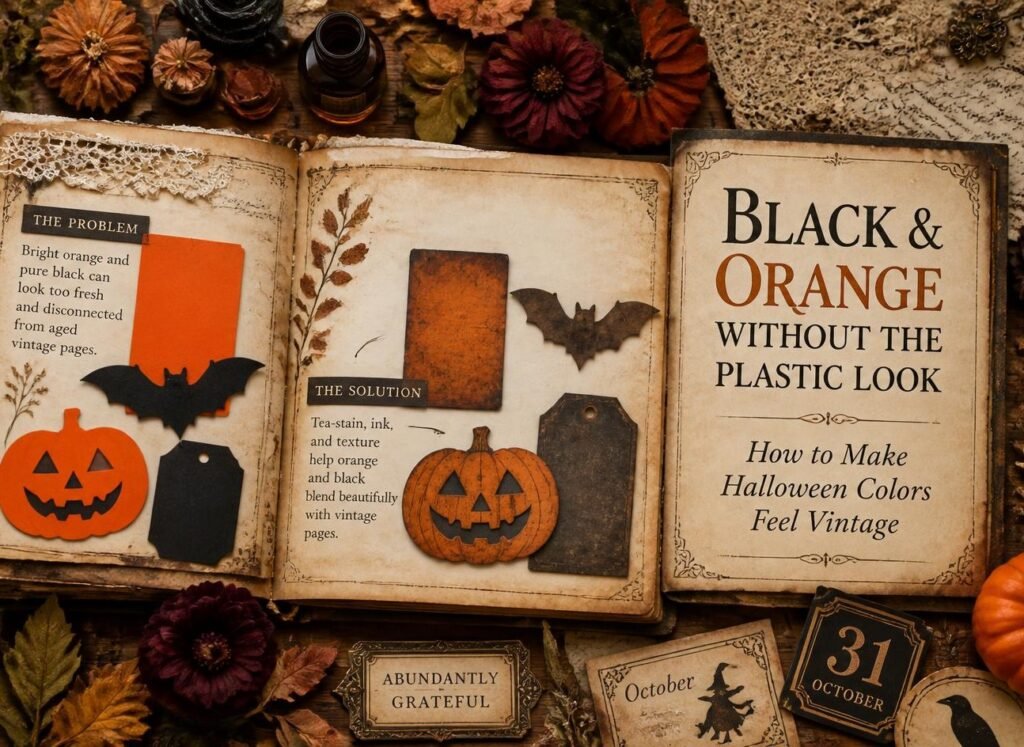
You bought the orange card. You cut out the bats. You glued them onto a lovely tea-stained page, and somehow the whole thing now looks like a party bag.
It’s not your layering, your cutting or your idea. It’s those two colours, straight out of the packet.
Black and orange are Halloween, and you shouldn’t have to abandon them to get a vintage Halloween aesthetic. You just have to age them the same way you age everything else on the page.
The one-sentence version: shop orange and shop black are fully saturated with no age in them, so they sit on top of your aged paper instead of settling into it. Every fix below is about taking that saturation out.
Why the classic combination goes wrong
Everything else on a junk journal page has faded. Book pages have yellowed, kraft has softened, tea-stained paper has gone blotchy and warm. Age removes brightness, that’s why old things look old.
Now drop a piece of fresh orange card onto that. It has lost nothing. It’s as bright as the day it was printed, and beside genuinely dulled paper it reads instantly as new.
Pure black has the same problem in the opposite direction. It has no warmth at all, so instead of reading as a shadow it reads as a hole punched in the page.
Once you notice this, you can’t unsee it, and fixing it takes seconds.
Six ways to mute bright orange:
In order of speed. The first one alone will rescue most pages.
1. Ink the edges (4 seconds):
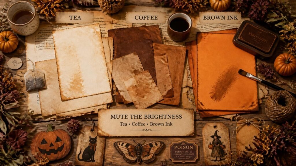
Drag every cut edge across a brown ink pad. The dark border immediately anchors the piece to the page, and it stops your eye reading the shape as a clean modern cut-out.
2. Wipe brown ink across the face (10 seconds):
Not just the edges, rub an inky fingertip lightly over the surface. It knocks the top layer of brightness off without changing the colour underneath. This is the fastest full fix there is.
3. Weak tea wash (10 minutes, mostly drying):
Brush cooled weak tea over the orange piece and let it dry. Everything shifts a step towards rust, and the unevenness of the wash adds the blotchiness that real old paper has.
4. Print or glue onto kraft instead (no work at all):
If you’re printing orange elements, print them onto brown kraft rather than white paper. The paper colour drags everything towards rust before it even leaves the printer.
5. Sand the surface (30 seconds):
Fine sandpaper, rubbed lightly across printed orange, lifts some of the ink in patches. The result is worn and uneven, exactly like a rubbed old label.
6. Cover part of it (instant):
Layer something over the orange, vellum, tissue paper, a torn strip of book page across one corner. Breaking up a flat bright area is often easier than trying to change it.
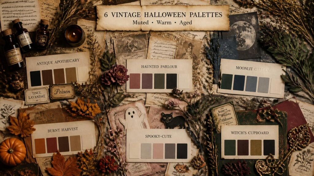
Five alternatives to pure black
Sometimes the answer isn’t muting black but replacing it. Each of these gives you the dark you need with warmth in it.
| Instead of black | What it gives you | Where to find it |
| Very dark brown | Reads as shadow, not a hole | Brown ink pad, dark kraft |
| Tea-washed black card | Black with the flatness removed | Any black card + weak tea |
| Charcoal grey | Softer, works with cool palettes | Pencil shading, newspaper |
| Bottle green | Almost-black, but with depth | Dark packaging, wine labels |
| Oxblood | Dark and warm, very old-world | Deep red packaging, coffee stain over red |
The two-second version: tea-wash your black card. Brush weak tea over a sheet of plain black card, let it dry, and it comes out slightly softened and dusty rather than flat. It’s the single easiest change in this article.
Using them together:
Once both colours are muted, the classic combination works beautifully, but the proportions matter.
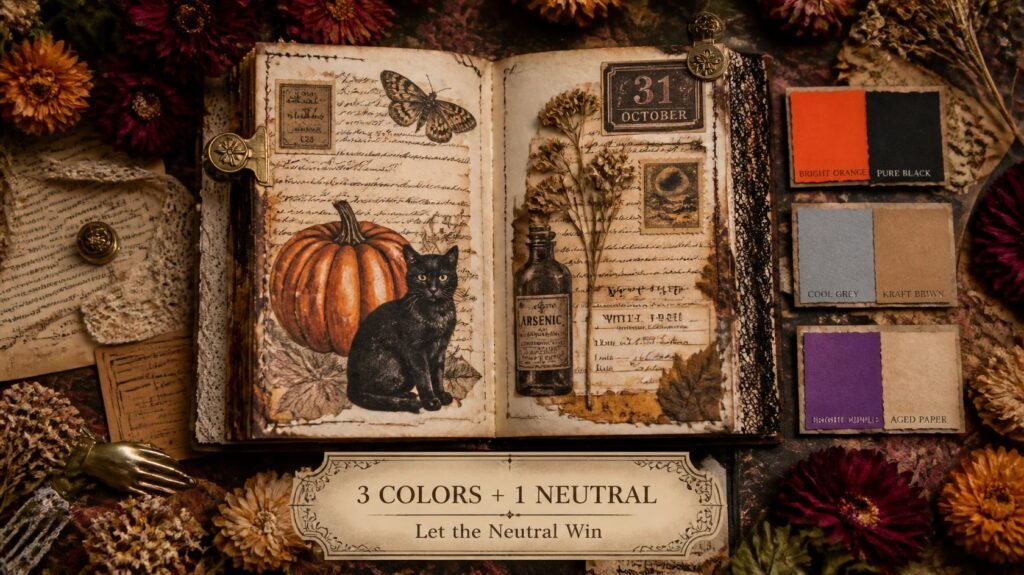
Neither one should dominate. A page that’s half orange and half black fights itself. Let a neutral, bone, cream, oat, kraft, cover most of the spread, with orange as the supporting colour and black as a small accent. Or reverse those two. Never let both be loud.
Put something between them. Orange directly against black is where the party-bag feeling comes from. A layer of aged paper, lace or vellum between the two softens the contrast enormously.
Add a third, quieter colour. Sage green, dusty rose or a muted teal alongside your orange and black immediately reads as vintage rather than seasonal-aisle, because two-colour schemes are what shop packaging uses.
The rescue for a finished page: if a spread already looks too bright, don’t remake it. Brush a very weak tea wash over the entire thing and let it dry flat. Everything mutes together at once, and suddenly the pieces belong to each other.
What to buy and what to skip?
If you are buying anything, this is where the money is worth spending.
Worth buying: a brown ink pad. Around £3, lasts years, and fixes more Halloween problems than every other supply combined.
Worth buying: cream or ivory paper. Printing on cream instead of white does half your ageing before you touch anything.
Skip: Halloween-themed paper packs. They’re almost always printed in exactly the bright orange and pure black this whole article is about undoing, and you’ll spend more time muting them than they saved you.
Skip: glossy anything. Gloss reflects light, resists glue and ink, and looks plastic beside aged paper. There’s no Halloween page it improves.
If you’d like printed pieces already designed in muted vintage tones, our Halloween sets print at home and cut down in minutes, have a peek in our Etsy shop.
Three vintage Halloween looks with no orange at all
Worth knowing, because dropping orange entirely is often the easiest route to a genuinely antique feel, and it’s what most of the loveliest vintage Halloween pages actually do.
The sepia photograph look. Amber, bone and brown-black only. Everything on the page sits within a narrow warm range, like a faded photograph. Add one small dark accent and nothing else. This is the most reliably elegant Halloween palette there is.
The green-and-bone apothecary. Bottle green, brass and cream. It reads as old chemist’s shop rather than Halloween shop, and it works right through November when the orange pages start feeling out of date.
The grey-and-rose parlour. Charcoal, dusty rose and faded cream. Softer and stranger than anything orange achieves, it suggests an abandoned house rather than a celebration, which is genuinely more unsettling.
All three still read as Halloween because of what’s on the page, moths, bottles, moons, old photographs. The season comes from the subject matter far more than from the colours, which is the thing most people have backwards.
A quick before-and-after test:
Try this once and the principle will stick permanently.
Cut two identical shapes from the same orange paper. Leave one alone. On the other, ink all the edges, wipe an inky finger across the face, and crumple and flatten it.
Now place both on a tea-stained page, side by side.
The untreated one will look like it’s hovering above the paper. The treated one will look like it belongs there. Same colour, same shape, thirty seconds of difference, and that’s the entire skill.
Frequently asked questions:
1- How do I tone down bright orange paper?
Wipe a brown ink pad across the surface and edges. Ten seconds, no drying time, and it takes the brightness off immediately. For a bigger shift, add a weak tea wash and let it dry.
2- Why does black look wrong in my junk journal?
Pure black has no warmth, so beside aged paper it reads as a hole rather than a shadow. Use very dark brown instead, or brush weak tea over black card to soften it.
3- Can I have a Halloween journal without orange at all?
Easily, and many of the loveliest ones do. Amber, sepia, bone and brown-black read as vintage Halloween on their own. Orange is traditional, not required.
4- What’s the fastest fix for a page that looks too bright?
A very weak tea wash over the whole finished spread. Everything mutes together at once, which is far quicker than treating each piece and usually looks better too.
5- Should I buy Halloween-themed paper packs?
Generally no. They’re printed in the exact saturated colours that cause this problem, and muting a whole pack takes longer than aging plain paper yourself. Cream paper and a brown ink pad go much further.
6- How much orange should be on a page?
Enough to notice, not enough to dominate. Let a neutral cover most of the spread, with orange supporting and black as an accent, or swap those two roles. Both loud at once is what looks like packaging.
7- Does this work for printed cliparts too?
Yes, and they need it most, print colours are usually the brightest thing on any page. Ink the edges, then a weak wash, and they’ll sit down into your layers.
8- What third colour goes with muted orange and black?
Sage green, dusty rose, muted teal or bone. Any of them stops the page reading as a two-colour seasonal scheme, which is the main thing that makes shop Halloween look like shop Halloween.
Rescue one piece tonight
Find the brightest orange thing in your craft stash. Ink its edges, wipe an inky finger across it, crumple it, flatten it.
Then put it next to a piece of tea-stained paper and see what happened. That thirty seconds is the whole difference between a Halloween page that looks bought and one that looks found.
For six full palettes with hex codes, see Halloween Junk Journal Colour Palettes. To age the paper underneath, read How to Age Paper for a Haunted, Antique Look, and for pages to put it all on, 20 Halloween Junk Journal Ideas. ♡
Our Etsy shop is full of adorable printable cliparts — birthday boys & girls, sweet animals, summer and spring themes — designed to print at home and layer straight into your journal.
Browse the Clipart Shop ↗
Leave a Reply